This is a guest post by my fabulous eDesign team member Lisa. She has a gorgeous historical home and she recently did a revamp in coordination with Photowall for her home office. What a creative and inspiring space to work in – especially with such a pretty backdrop for Zoom calls!
From boring farmhouse to romantic landscape
When my husband and I purchased this old home and started renovating it 8 years ago, I too fell victim to the “farmhouse” craze and implemented this trendy style into all the rooms with decor, paint and hard finishes.
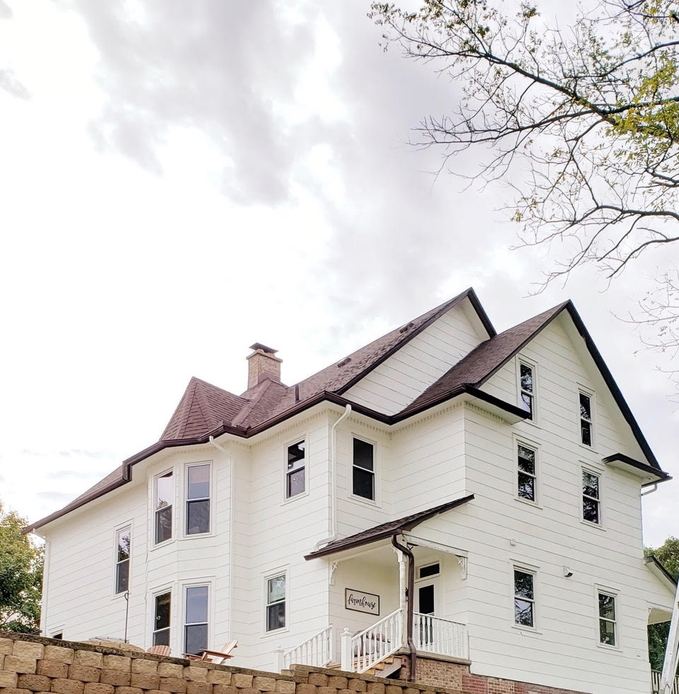
EVERY colour decision I made was either black, white, beige or grey – even on the exterior. So, it’s a good thing the existing brown roof was new and wasn’t changing AND that our budget only allowed for stock white windows. Otherwise I would’ve chosen black for both and we all know where that would have left me.
Working from home as part of the MK eDesign team has literally been a dream come true! Once I started, I immediately set up shop in this dining/crafting space that is central to the main areas of our home so I could still be present in the daily happenings, all while having a dedicated space for work.
Exhibit A: Farmhouse office (BEFORE)
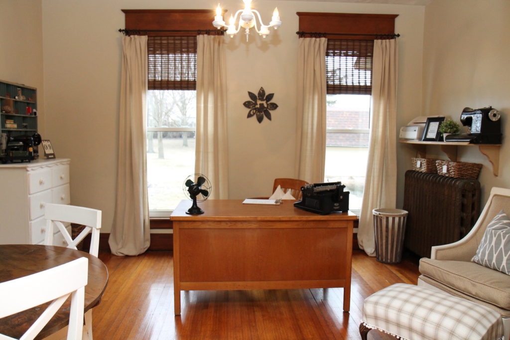
It was “ok” but it lacked real style, personality and COLOUR! As I started following, and later working for Maria I quickly realized my problem – I ignored the existing fixed finishes in my home and tried way too hard to turn it into something it clearly was not.
White furniture and a completely neutral colour palette did absolutely nothing for the rich wood trim and historical nature of this home. The decor was merely a hodge podge of furniture without any real character or interest. Although I work from home I still wanted a space that felt like a “real” office – something that was both inspiring to work in but also flowed with the other living space.
Once I started considering the existing elements rather than simply ignoring them was when the magic started to happen and the spaces in our home came to life and looked as though a designer had touched them.
Landscape wall mural inspiration
I was truly inspired by the mural Chris Loves Julia installed in their home office – it created a moody and dramatic feel, which was just what I wanted for my space as well. However, wrapping the entire room in a mural or wallpaper was not something I was interested in doing.
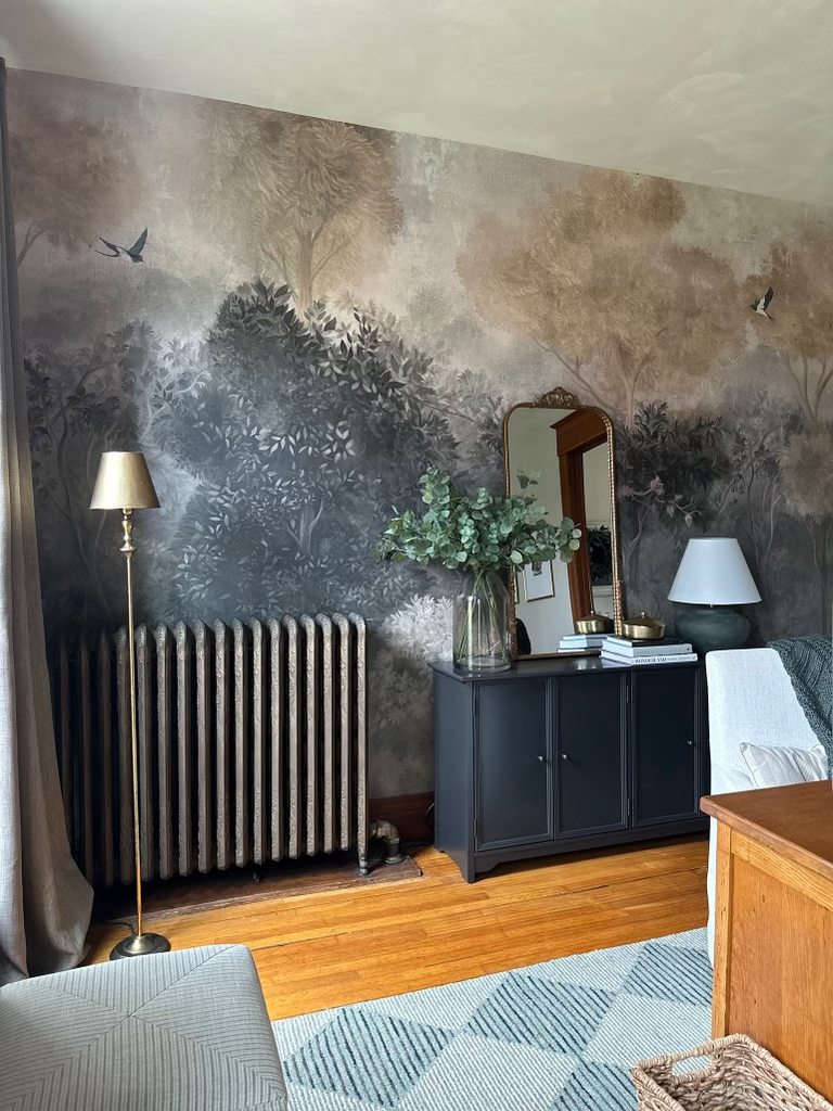
A feature wall is better suited for the room since this wall was such a focal point in the space and the adjoining living area as well.
And of course this stunning feature wall would create the prettiest backdrop for daily zoom calls with the MK team.
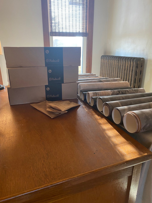
Photowall generously agreed to work with me on this project for Maria’s blog. First, I ordered samples of murals I liked to get a true read of the colours. As I mentioned before, the massive orange toned woodwork is the boss when it comes to choosing coordinating colours and finishes so comparing is a MUST!
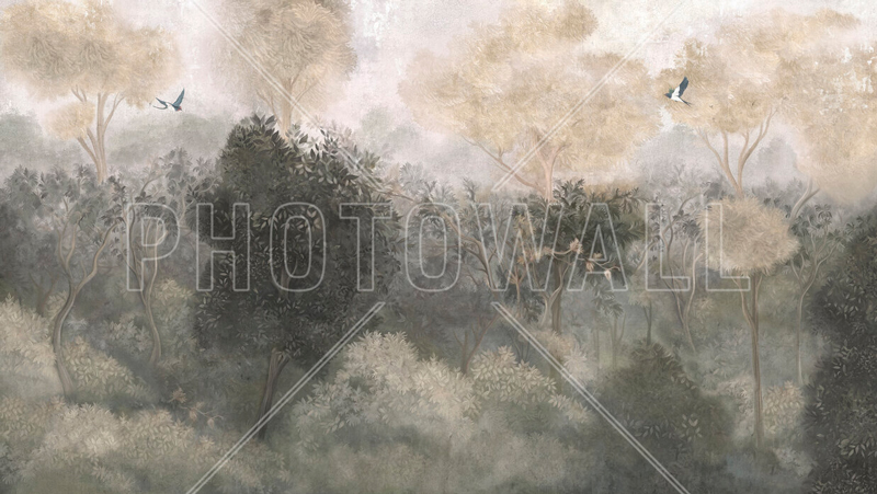
Romantic Landscape Mural (neutral) – Photowall
Once the samples arrived I immediately knew which one worked best with the woodwork and also had the moody and sophisticated vibe I was after. The next step was creating a mood board to help visualize the mural in the space.
Learn how to make inspiring mood boards so you never get the colour wrong again!
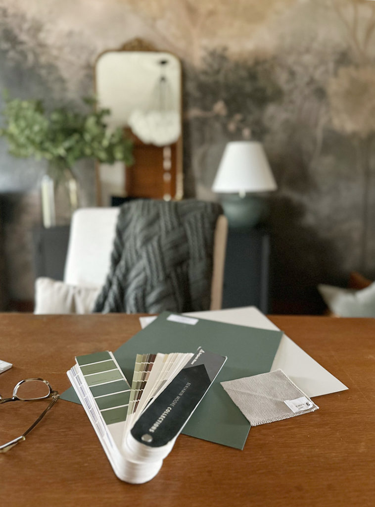
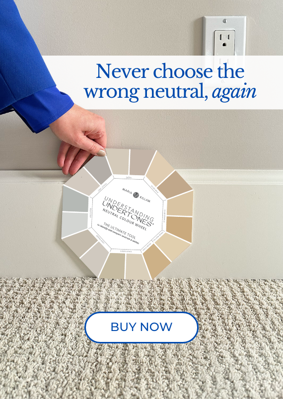
This mural is quite tricky as it contains nearly every neutral in Maria’s system, however the most prominent neutral undertone in the background of the paper is what direction I wanted to go for painting the walls.
Once I determined violet grey was the right choice I pulled out my large colour boards and started comparing violet greys in Maria’s system to the mural and my woodwork as well to ensure a good match all while having enough warmth to complement the trim that is such a prominent feature throughout.
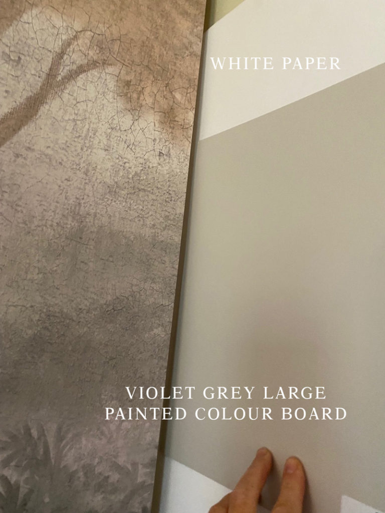
Testing with Maria’s large painted colour boards
My colour shopping besties: Mood Boards & Colour Boards
As the mood board began to take shape I started shopping for accessories in both a deep blue green and violet grey to provide connection to the colours present in the mural and the green I was already decorating with in other areas of our home to create flow.
A mood board is extremely helpful in getting the colour right while shopping online. Using the paint dots from the palette allowed me to narrow down the selections for textiles and decor while shopping online.
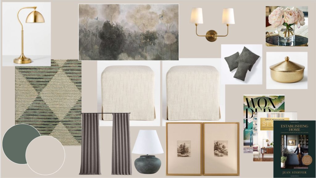
Draperies | Diamond Pattern Rug | Sideboard | Stools | Task Lamp | Brass Canister | Wall Sconce | Table Lamp | Knit Textiles | Frames | Artwork | Filigree Mirror
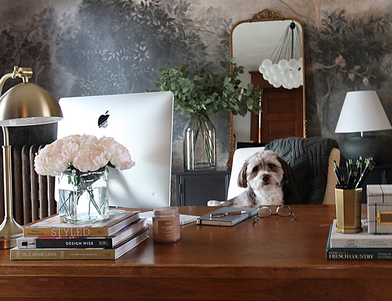
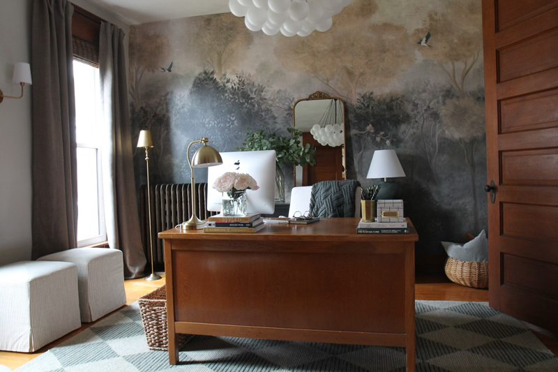
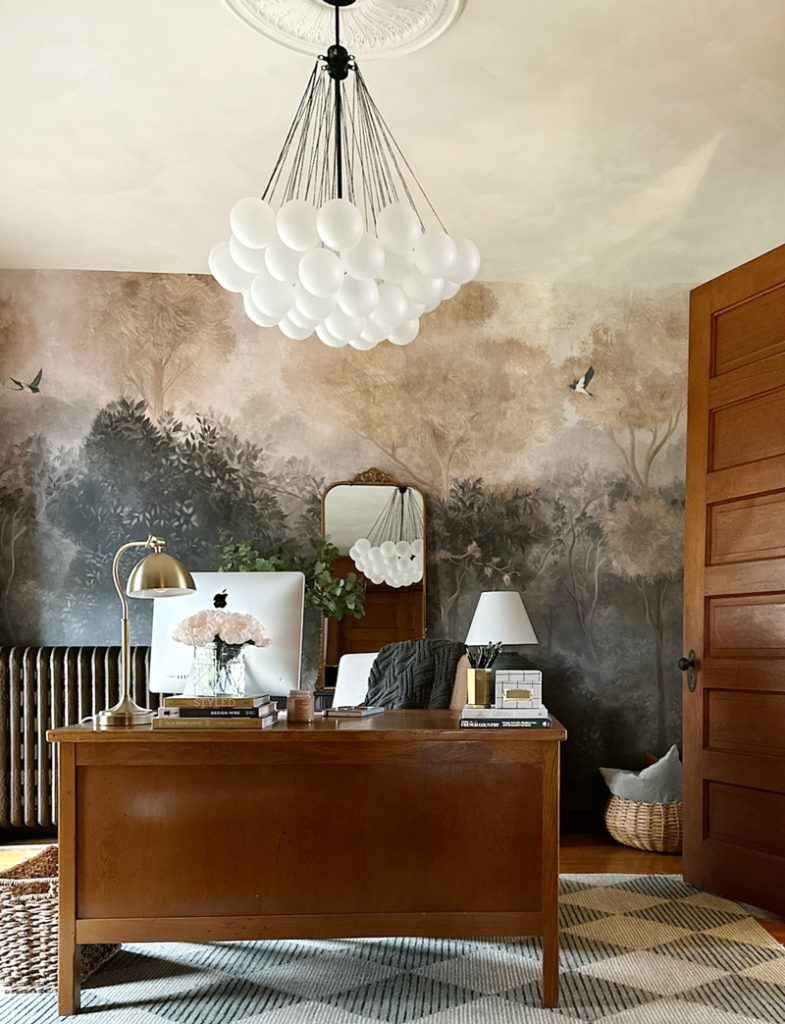
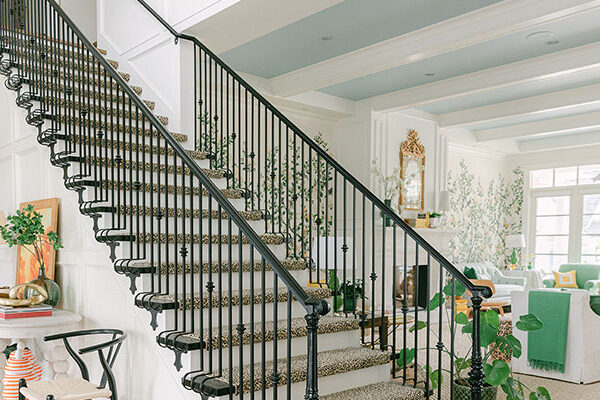
The mural went up like a breeze. It was customized to the exact measurements of my wall and came in 10 easy-to-install strips – all labeled so no mistakes could be made – so simple to do!
Landscape mural wall reveal
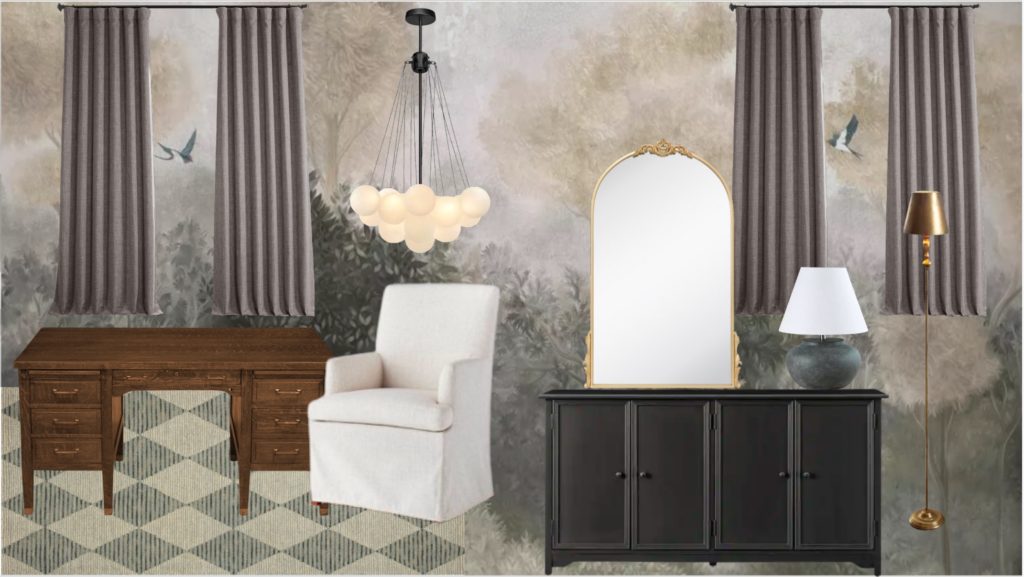
Here’s how it turned out…
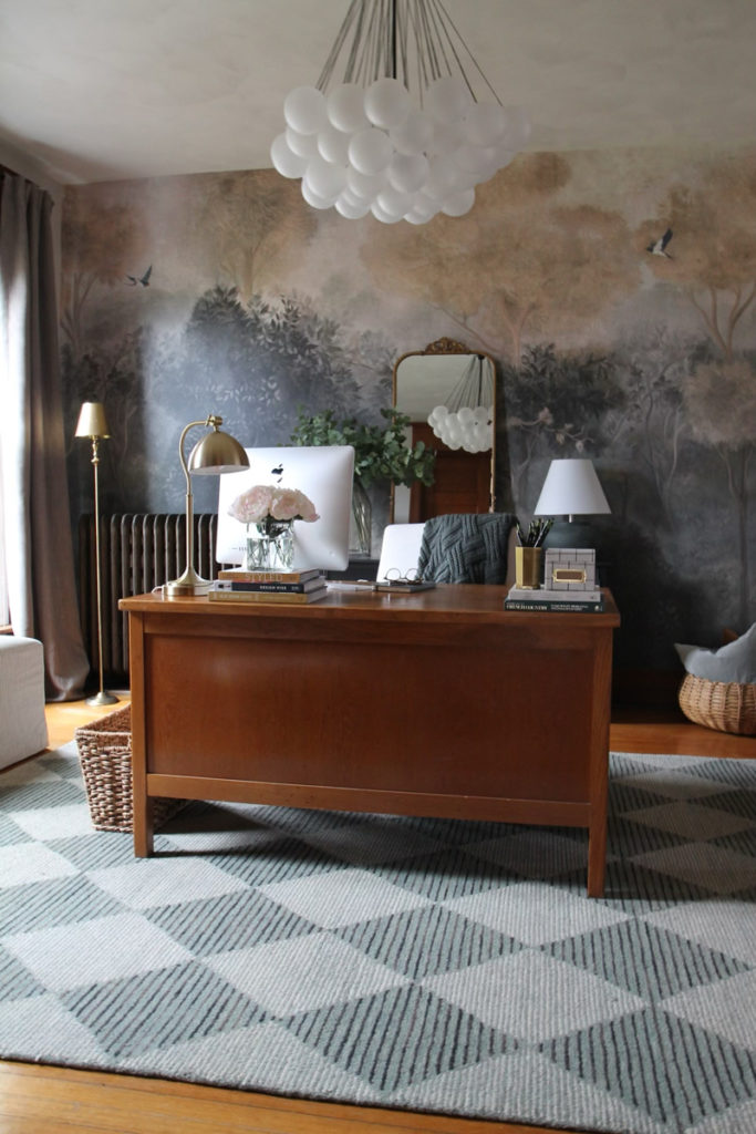
Romantic Landscape Mural – Neutral
Since the mural is quite dark, and such a large element, I needed to repeat the same depth of colour again in a small and medium scale to ensure proper balance. (Just like Maria talks about how to incorporate black in your decorating).
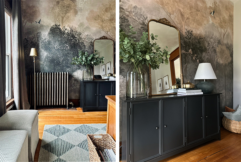
I did this with a charcoal sideboard (medium) that melts into the background visually, allowing the mural and decor to be the star and then repeated the darkness again with the black chandelier (small). Even that dark old radiator seems to melt into the background now – don’t you think?
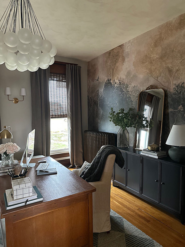
Charcoal Sideboard | Bubble Chandelier
Similar Brass Floor Lamp | Draperies | Diamond Pattern Rug | Sideboard | Stools | Brass Canister | Table Lamp | Filigree Mirror
Pretty lighting and plenty of lamps
And let’s not forget lighting! This is the single most important lesson I ever learned from following Maria – every room needs lamps in order to have a look and a feel that gives balance and mood.
And not just the set of 3 matching lamps you buy in a box set! Always choose a variety of lighting for a more collected look.
Read more: Can You Layer Lamps in Front of Your Artwork?
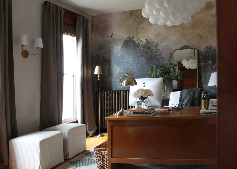
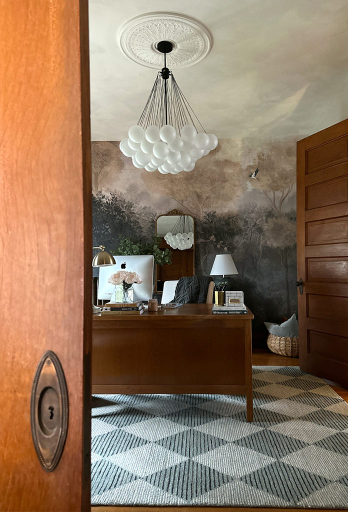
And don’t forget, your overhead lighting should be pretty as well. So of course I had to add a trendy bubble chandelier that gives off the most beautiful violet hue through the soft white frosted bulbs – it is truly like I am sitting under a cloud.
I love that my pup is a bit violet grey too!
I am a budget shopper, so most of these items were purchased online at Target, Amazon, Home Depot and Kirkland’s and are linked above under my mood board – except for the puppy. Because he’s priceless ♥️.
Fun fact – you know you have the best boss ever when she gifts you pretty lamps for your birthday. This antique brass stick lamp is a constant reminder of how gracious and thoughtful Maria is ♥️ and it fits so well into the design.
Similar Brass Floor Lamp | Stools
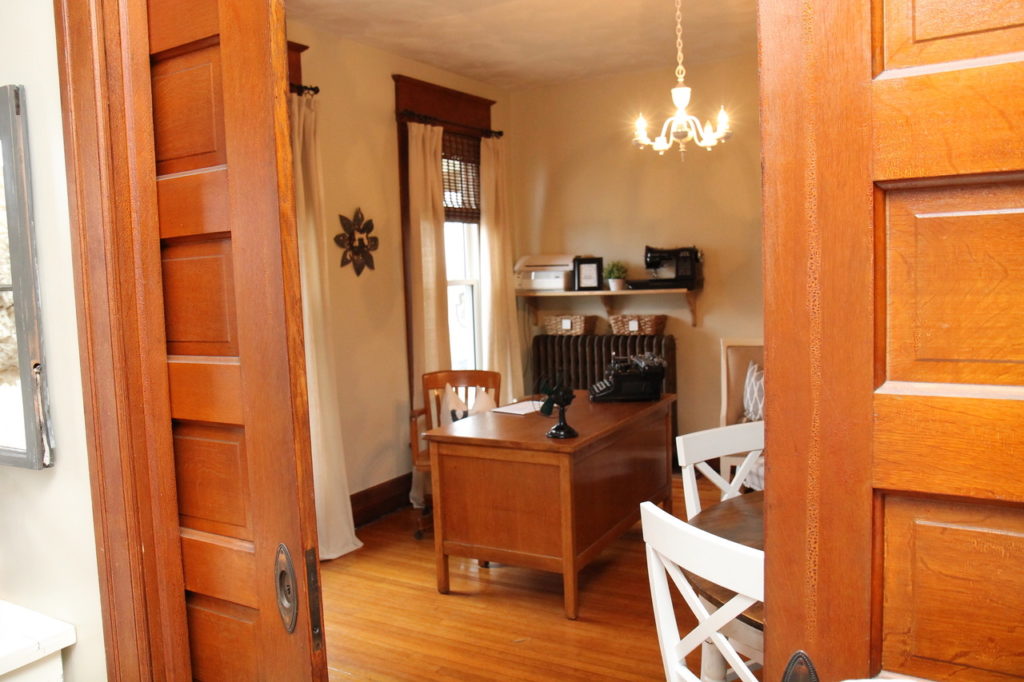
I also like to include a few vintage pieces in a room as a nod to its history, like this antique teacher’s desk that the previous homeowners gifted me when they passed this home on to us. (and we love our original pocket doors that still work to divide the room from our living room)
Mixing patterns can be tricky, but helps give the room depth and dimension. I fell in love with this diamond pattern rug and it connects perfectly to the deeper greens in the mural and then I added these pinstriped footstools, which happen to also be violet and green grey 😉 Layers of texture in warm brass metal accents, woven baskets, and chunky textiles, are a cozy addition as well.
Go ahead and take a look at the before again…
And now the after….
Since learning Maria’s system and coming into my own as a highly trained designer I have labeled all the rooms in our home either PM or AM (“Pre Maria” or “After Maria”) because learning her system is truly like “night and day.” Comment below if you agree!
And I am so happy to have added yet another space to the “After Maria” category. Be sure to head on over to Photowall to see gobs of pretty wall murals!
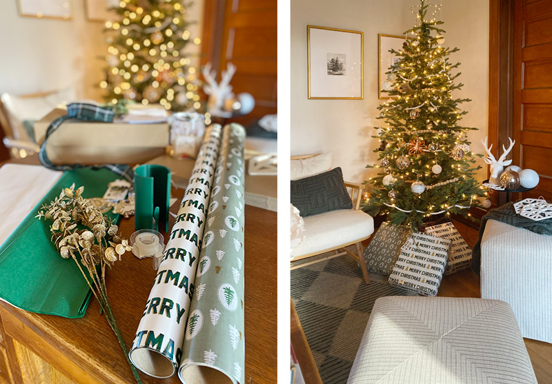
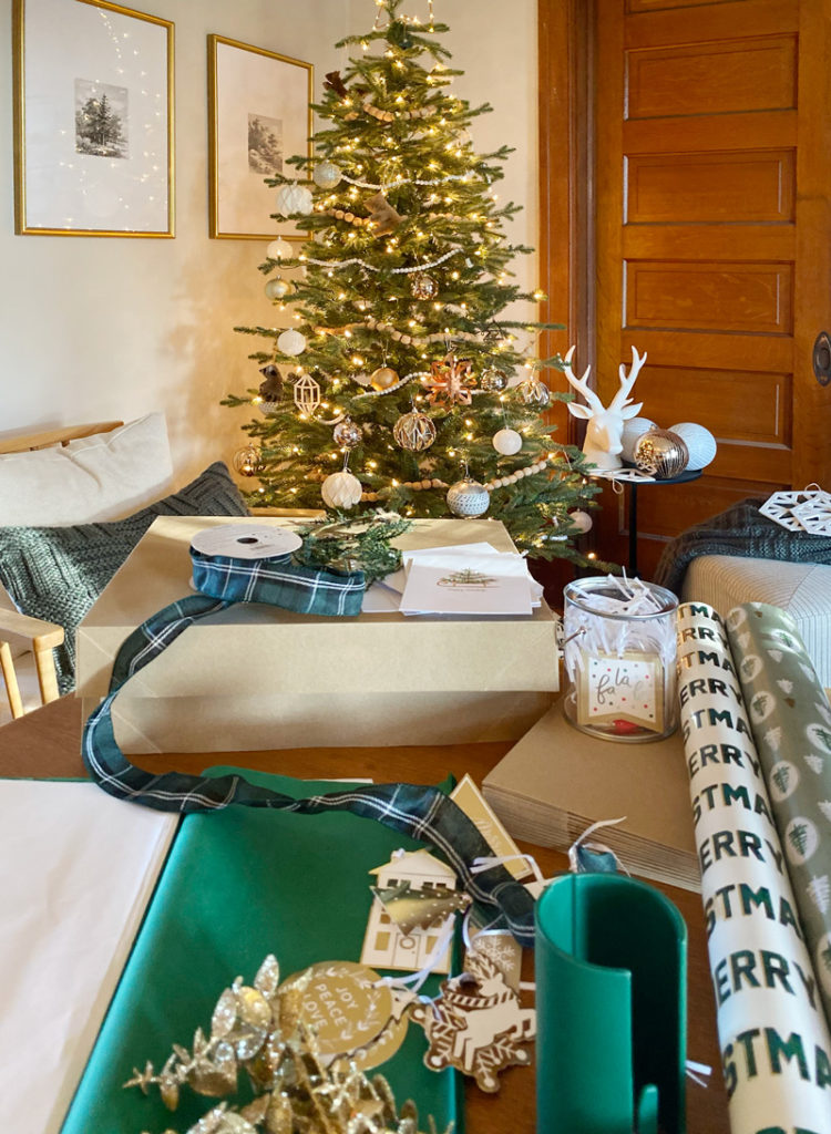
Oh, and this lovely workspace doubles as a wrapping station this season… here’s a one more look at my home office with some holiday vibes. Merry Christmas everyone!
_____________
Thank you Lisa!
And thank YOU to everyone who visits this blog, my social media accounts, shares comments, purchases something, or simply enjoys my content – I’m so GRATEFUL for each and everyone of you. Wishing you the merriest of holidays this season and looking forward to a wonderful new year.
Snowed in? It’s the perfect time to snag one of my online courses and snuggle in on the sofa with a glass of wine. Just sayin’ 🙂


Wow ! That was amazing ! Love the transformation.
Added so much life and warmth to your space .
STUNNING!!! Love the round balloon glass chandelier! I am currently looking for that same chandelier for a high entry front hall. Would you kindly share the source! Thank you!
Hi Ericka, thank you! If you scroll up the blue text under the photos are clickable links for most of the items I used in the room, including the lovely bubble chandelier!
Thank you, Lisa!! Your entire room is stunning!!
You are so right about the PM and AM comparison. This is a beautiful room. Everything in it in , both old and “new” relates to each other and is a beautiful composition.
This is a beautiful room. I hope you share more of your home in the future.
Your finished room is beautiful!!! I would change one thing – that chandelier looks way to much like water balloons (have you seen how you hook a bunch to the hose and as they fill it looks just like this!). Just my opinion, it does not fit the otherwise beautiful and relaxing vibe you have created. You can do better!
I love the chandelier!! It’s a beautiful fixture! Looks amazing in this space.
I agree! The chandelier “makes” the room. So different and beautiful!
I also find this chandelier distracting in an otherwise beautiful room – wonder if you will still love it in a year??
Hi Maureen! I am sure I will since it is one of my favorite elements in the space! But that’s the great thing about lighting, as trends change you can easily switch them out 😉 And, it helps that my husband is super handy and can do those types of things for me ♥️
Maria, you hired a gem in Lisa! She is the epitome of a student who learned your fabulous talents well.
I wish you both a lovely holiday season with your loved ones. Such inspiration!!!
THIS is one of the most stunning before & afters I’ve ever seen! It must bring you so much joy to go to work in this office.
Thank you Christine for the lovely comments – it is such an enjoyable space to be in ♥️
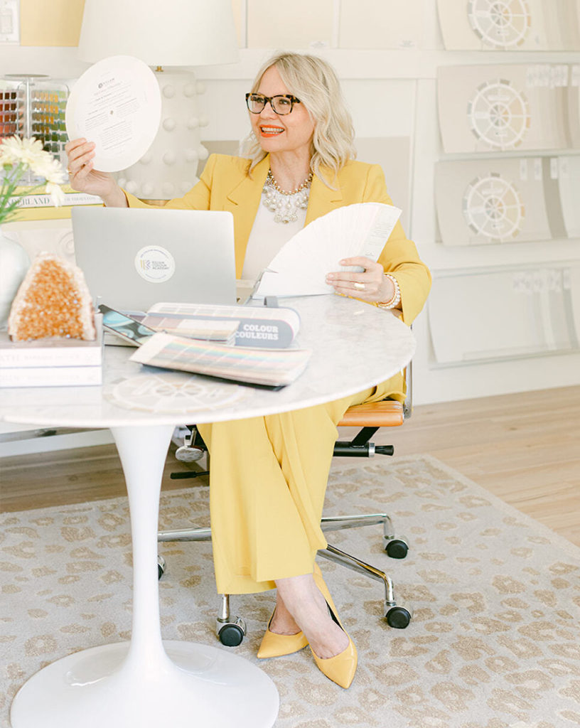
Beautiful and I love the mix of antique and modern! Well done! Question for you…what is the name of the green colour board shown on your desk? Caldwell Green?
It’s an office space I’d never want to leave.
I’d like to know as well! Thank you.
I hope she responds to you! I’d like to know the color as well… I had a sample of Caldwell Green, to my eyes that is not green enough to be Caldwell Green… this looks closer to something like Revere Pewter.
Hi Jennifer! I used SW Pediment for the walls, a violet grey in Maria’s system since it paired so well with the mural and had just the right amount of warmth and violet to complement the warm woodwork.
Hi Wendy, thank you! Yes, the colour board on my desk is BM Caldwell Green.
Thanks for your response. I’m working on a project and was considering using it with a violet grey. Beautiful together.
Please keep us posted if you move on to redecorate your other rooms. It’ll be fun to watch.
What a beautiful transformation, just gorgeous! Merry Christmas!
Lisa did a FANTASTIC job with her home office! I love everything about it.
Beautiful job, Lisa! Love the mix and collected feel you have given this space.
Beautifully put together room! Looks like a delightful place to work. Love the mural and how everything works together in layers.
Love the chandelier. Yours looks full so I’m guessing it’s the 37 bulb one. But is there really still only 3 actually lights on it?
Hi Sue, thank you! Yes, I opted for the 37 bubbles and boy am I glad I did, it makes such a statement! And yes, only 3 light bulbs – can you believe it?!?! I was skeptical it wouldn’t provide enough light but it is perfect. It illuminates the entire room and the filtering through the frosted glass globes gives a much softer presence over head.
Wow, what a difference! I wouldn’t have thought the “before” was terrible, but I see what you mean about harmonizing with the elements of your home instead of fighting against them. It is so beautiful and serene now.
Stunning! 💗
Just wow! Such a transformation – and so well written to illustrate how to use the color system. I’ve been thinking of doing this for my new build bedroom to give it some soul. You’ve convinced me.
That is so great Dona!
Even though the decor is not my style, I still have to say it’s appealingly put together and the end result is beautiful. AND, I think it’s very clever how you styled the space in front of your computer monitor … When my eyes had glanced all through the room I thought to myself, “yeah, but when you put a computer on the desk it changes the look”, and then I looked closer and lo and behold there it was just very cleverly hidden behind the styling elements . Good job!
The best word that comes to mind is Spectacular! Everything is absolutely stunning. That room is a great example of planning, mood board and choosing the right colors. Well done!
Oh how truly beautiful! Yes the moodboards I make for my clients are absolutely essential to have a mini preview before pulling the trigger and ordering the items! I couldn’t do online design otherwise. Great job!!
I would love to see this room in person. I love love the mural. I love love the chandelier. What a delightful room to call your study! The lamp on the desk is very classy. I am leaning much more towards the bronze or brass finishes on lamps, etc. Look forward to seeing your home when you are through decorating as I am Maria’s home.
I LOVE MURALS! Your office is a dream and must be unforgettable for anyone seeing it.
Love all the lamps and the area rug is perfect.
Wow! Stunning! And what a great post to show how you did it. Now I want to re-do my home office! We spend so much time in them they should be inspiring. Thanks so much for sharing. Now I’m going to start day dreaming about how to update mine. 😊.
Love everything in the room. Such a fresh look using new and antique pieces. Great job!
Where/how do you get the”paint dots from the palette”?
I’d like to know the answer to this question as well. thanks
Maria provides instructions for getting the paint dots as well as creating beautiful mood boards just like this in her Shop Online with Colour Confidence online course. 🙂 Get it here: https://mariakillam.com/shop-online-with-colour-confidence/
Thank you!
Maria provides instructions for getting the paint dots as well as creating beautiful mood boards just like this in her Shop Online with Colour Confidence online course. 🙂 Get it here: https://mariakillam.com/shop-online-with-colour-confidence/
Love the mural! I’d like to do one in a bedroom I’m turning into an office/reading space. But I’m concerned it won’t work because we live in Las Vegas where the walls are all slightly textured. We’ve lived here almost 5 years and I’ve never seen smooth walls in any home I’ve been in.
The pinstripe fabric on the ottomans has been arranged to repeat the diamond pattern in the rug. What a beautiful detail. And the bubble chandelier is exactly the type of thing Ingrid Fetell Lee explains in her Ted talks and books as elements that bring us joy.
This is so well done!
Just beautiful Lisa!!
What a lovely job you did! Retaining the character of the house while adding contemporary touches takes some skill, and you nailed it.
I am curious about the ‘paint dots’ – is this something new with Benjamin Moore? Thank you
What a fabulous “after” picture. The room looks fabulous and layered.
I would love to see an image of what it looks like as a Zoom background.
Can you share a screenshot from that perspective? Thanks!
Love that mural. First time I saw one wS in a hotel on the Breckinridge property. I couldn’t stop stRing at it. But find a different place for the mirror. The mural is the star..